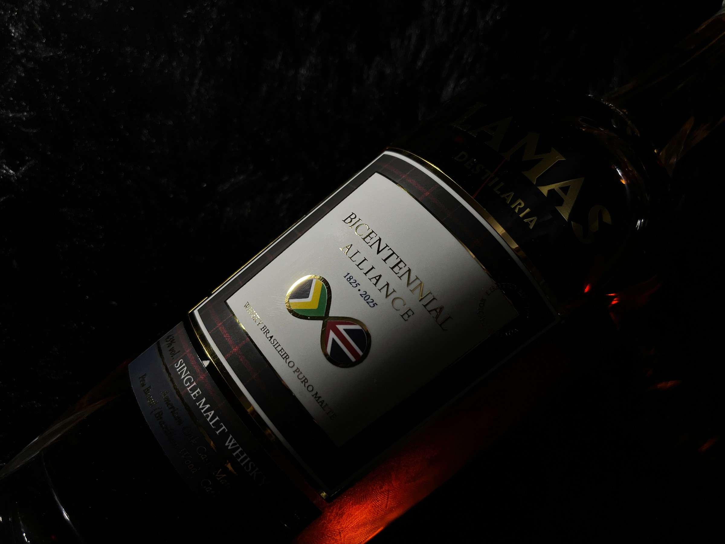
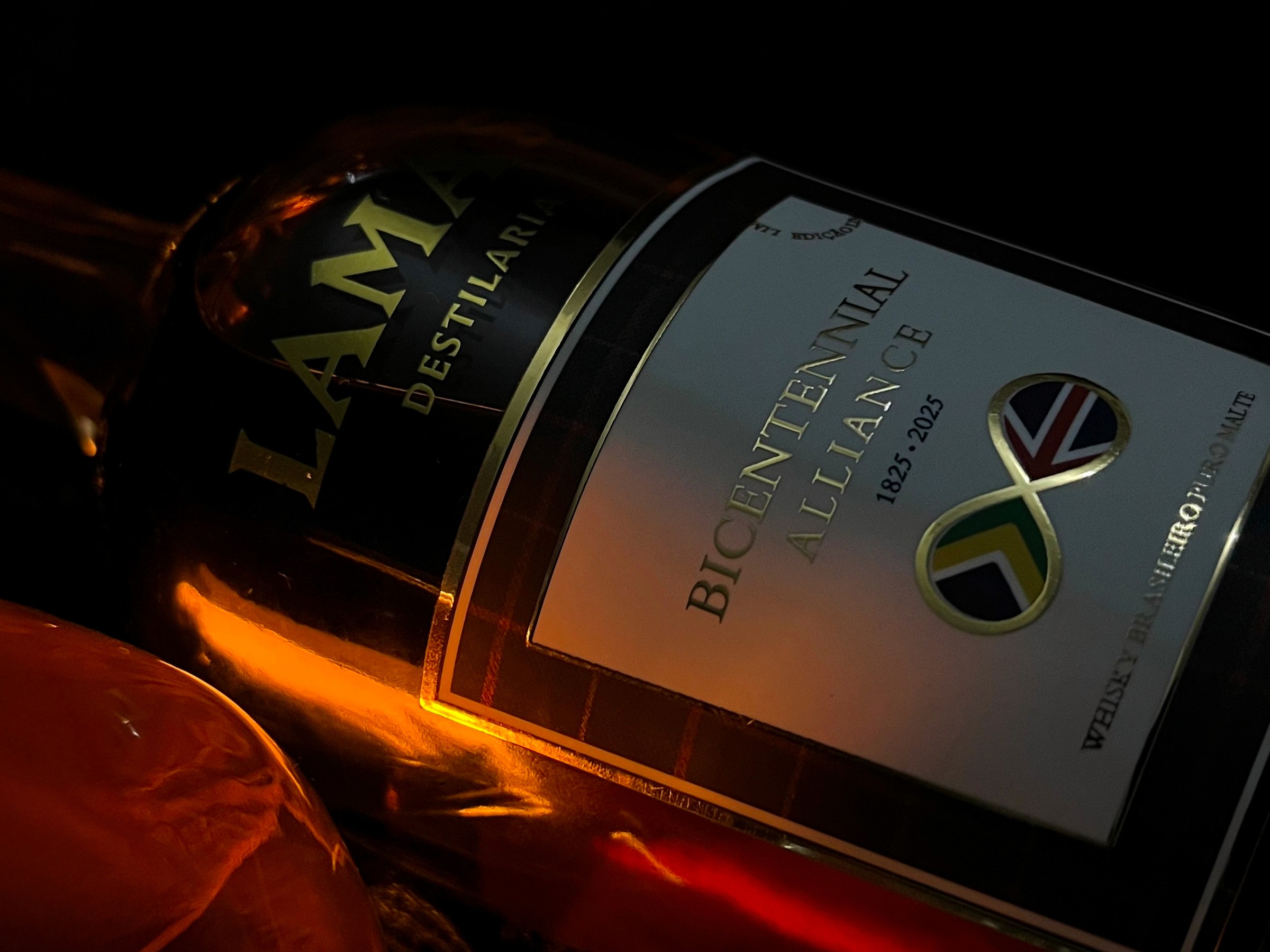
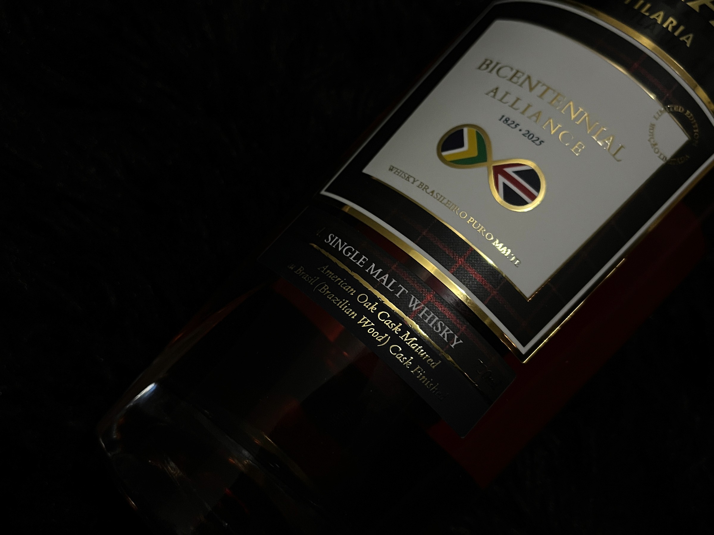
Bicentennial Alliance — Luxury whisky packaging
Packaging & Visual Strategy Designer — Led the creation of a premium whisky packaging system grounded in cultural symbolism and luxury standards
00
problem
Luxury spirits packaging must communicate heritage, authenticity, and exclusivity at a glance — especially when representing international collaborations. The challenge was to create a whisky packaging design that honored the historical and cultural identities of Brazil and the United Kingdom without relying on clichés, while still meeting the expectations of a high-end global market.
solution
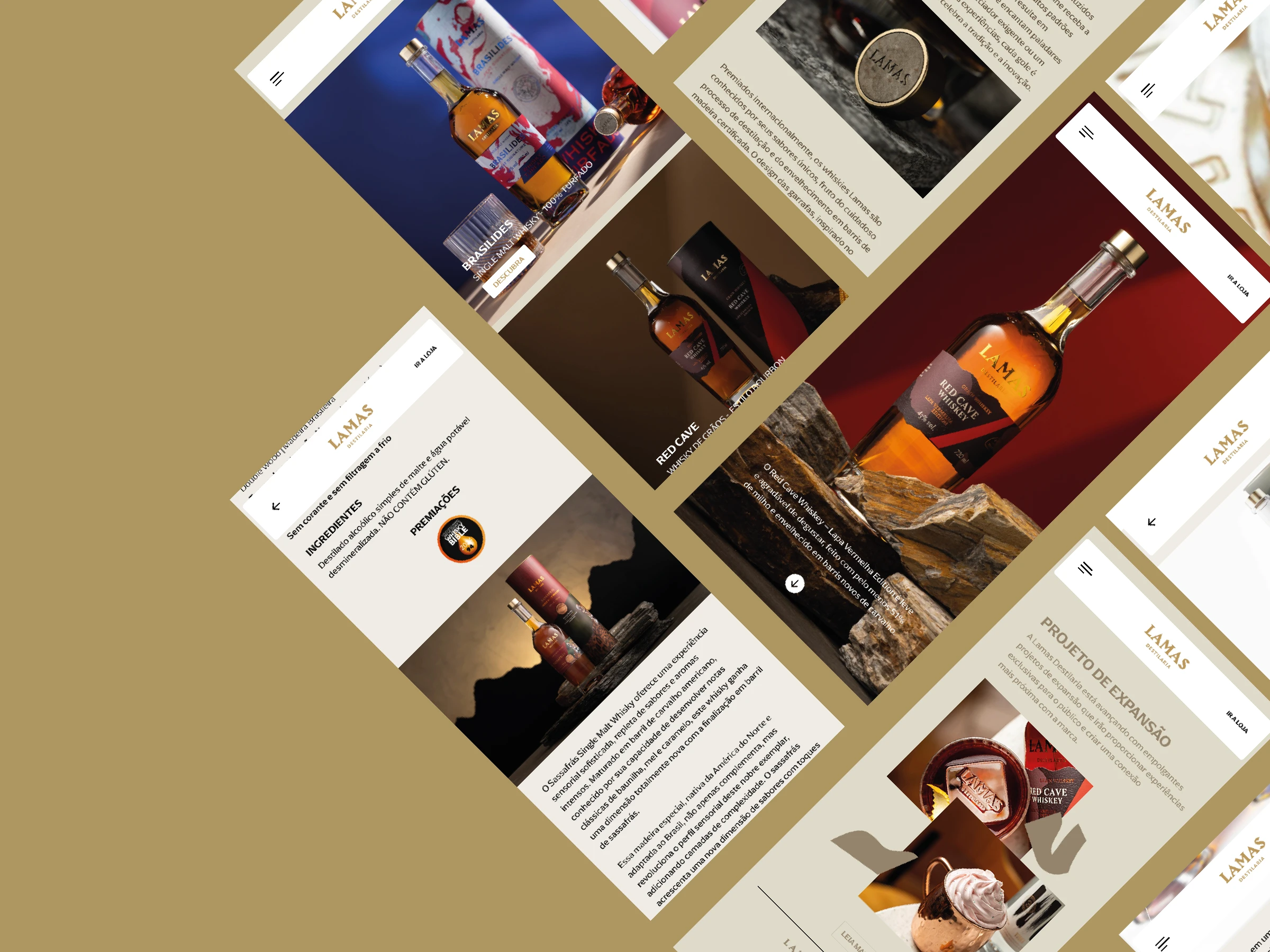
The solution was a refined packaging system built around restrained typography, balanced symbolism, and a carefully curated color palette inspired by both national identities. By prioritizing clarity, material perception, and visual hierarchy, the packaging reinforces a sense of craftsmanship and premium value, positioning the product as a collectible whisky rather than a mass-market offering.
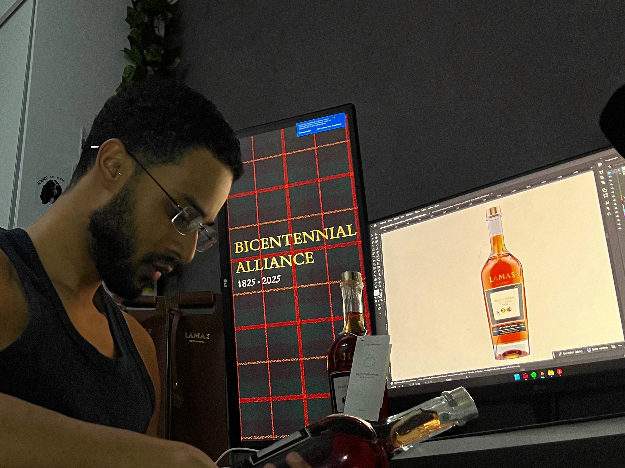
Bicentennial Alliance is a limited-edition whisky created to celebrate 200 years of diplomatic relations between Brazil and the United Kingdom — a milestone that connects history, craftsmanship, and cultural exchange.
Developed by Lamas Destilaria, the product required a packaging solution capable of translating this international alliance into a tangible luxury object, balancing British heritage in whisky-making with Brazilian identity and contemporary refinement.
The challenge was to design a visual system that conveyed historical significance without resorting to literal or patriotic clichés, while still meeting the expectations of a high-end, collectible spirits market. Every design decision needed to reinforce exclusivity, narrative depth, and premium perception at first glance.
The packaging was approached as a commemorative artifact rather than a conventional label. Typography, color palette, hierarchy, and composition were carefully structured to communicate diplomacy, tradition, and craftsmanship — positioning the whisky as both a celebration of international relations and a refined product for collectors and connoisseurs.
The result is a luxury whisky packaging that reinforces Lamas Destilaria’s positioning in the premium spirits segment while honoring the symbolic union between Brazil and the United Kingdom through a restrained, elegant, and internationally legible visual language.
This project reinforced how luxury packaging relies more on restraint, symbolism, and material perception than visual excess.
It also highlighted the importance of cultural sensitivity and system thinking when designing products for international markets.
01
02
03

04
see also